Make a website with Bootstrap
For my first participation to the Fab Academy I needed to create multiple websites. One of them was the Lab himself and his students The Lab’s website http://archive.fabacademy.org/2017/at3flo/.
How to start?
I decided to write it by “dirties hands” (html5 + css3 + js) with the framework Bootstrap (http://getbootstrap.com/).
To start my development I choose to use Atom (https://atom.io/) because I prefered it on Bracket (the behavior is really different between those two in terms of inner search). So I downloaded it and installed some usefull plugins like :
- Atom beautify (make the code clearer)
- Git Plus (all the commands at your finger tips to push your code via Git)
- Preview HTML (to live preview what I am doing on the html code)
- Split diff (to compare to files with others)
To learn the web basics, I followed the courses from David Rossiter HTML, CSS and JavaScript and from Jogesh K. Muppala Front-End Web UI Frameworks and Tools by The Hong Kong University of Science and Technology. Which are for me the bests courses I ever followed on web programming.
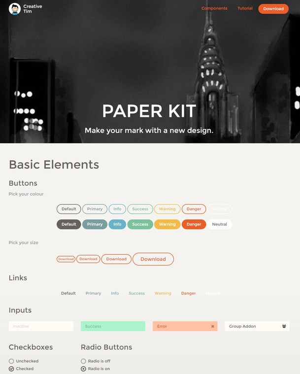
After that I went to Creative Tim’s website to get a skeleton to work with. I choose the Paper Kit one :
Let’s get hands dirty
Head: SEO and communications tools
Time to code some data I started with the head part as described below. I also used the Open Graph standard to be more integrated with communications tools (Whatsapp, SEO, etc.) with small thumbnails in it like this :

<!DOCTYPE html>
    <html lang="en">
    <!-- Specify the main language for this website -->

    <head>
      <!-- Make the website UTF 8 and Edge compatible and responsive to device width -->
        <meta charset="utf-8">
        <meta http-equiv="X-UA-Compatible" content="IE=edge">
        <meta name="viewport" content="width=device-width, initial-scale=1">
        <!-- The above 3 meta tags *must* come first in the head; any other head content must come *after* these tags -->

        <title>At3flo and the Fab Academy 2017</title>

        <!--Standard meta description-->
        <meta name="description" content="Fab Academy 2017 At3flo's repo">
        <meta name="keywords" content="HTML,CSS">
        <meta name="author" content="Matthieu Borgognon">
        <meta name="image" content="assets/img/logoA3O.png" />
        <meta name="copyright" content="CC BY-SA 4.0">

        <!-- Open Graph data (usually used by software like Telegram, etc. to make thumbnails) -->
        <meta property="og:title" content="Fab Academy 2017 At3flo's repo" />
        <meta property="og:type" content="Presentation of students work" />
        <meta property="og:url" content="http://www.at3flo.ch/" />
        <meta property="og:image" content="assets/img/logoA3O.png" />
        <meta property="og:site_name" content="At3flo" />
        <meta property="article:published_time" content="2017-01-23T14:26:00+01:00" />
        <meta property="article:modified_time" content="2017-01-29T17:32:00+01:00" />
        <meta property="article:tag" content="At3flo, Third Place, Fab Lab, Local exchange trading system" />

        <!-- Bootstrap -->
        <link href="bootstrap3/css/bootstrap.css" rel="stylesheet" />
        <link href="assets/css/ct-paper.css" rel="stylesheet" />
        <link href="assets/css/style.css" rel="stylesheet" />

        <!-- Fonts and icons -->
        <link href="http://maxcdn.bootstrapcdn.com/font-awesome/4.2.0/css/font-awesome.min.css" rel="stylesheet">
        <link href='http://fonts.googleapis.com/css?family=Montserrat' rel='stylesheet' type='text/css'>
        <link href='http://fonts.googleapis.com/css?family=Open+Sans:400,300' rel='stylesheet' type='text/css'>
    </head>
Responsive navbar
Then in the body part I fit the navbar to fit my requirements, mostly responsive :
Standard :

Mobile closed :

Mobile opened :

<nav class="navbar navbar-ct-transparent" id="demo-navbar">
        <div class="container">
            <!-- Brand and toggle get grouped for better mobile display -->
            <div class="navbar-header">
                <button type="button" class="navbar-toggle" data-toggle="collapse" data-target="#navigation-example-2">
          <span class="sr-only">Toggle navigation</span>
          <span class="icon-bar"></span>
          <span class="icon-bar"></span>
          <span class="icon-bar"></span>
        </button>
                <a href="index.html">
                    <div class="logo-container">
                        <div class="logo">
                            <img src="assets/img/logoA3O.png" alt="At3flo">
                        </div>
                        <div class="brand">
                            At3flo
                        </div>
                    </div>
                </a>
            </div>

            <!-- Collect the nav links, forms, and other content for toggling -->
            <div class="collapse navbar-collapse" id="navigation-example-2">
                <ul class="nav navbar-nav navbar-right">
                    <li>
                        <a href="https://www.at3flo.ch" target="_blank" class="btn btn-warning">At3flo's official website</a>
                    </li>
                    <li>
                        <a href="http://fabacademy.org/" target="_blank" class="btn btn-danger">FabAcademy.org</a>
                    </li>
                </ul>
            </div>
            <!-- /.navbar-collapse -->
        </div>
        <!-- /.container-->
    </nav>
Jumbotron
Then I wanted to have a header full width screen (the grey part), called Jumbotron in Bootstrap :

<header class="jumbotron">
    <div class="row">
        <div class="col-xs-10 col-xs-offset-1">
            <div>
                <h1>At3flo and the Fab Academy 2017</h1>
                <p style="padding:20px;"></p>
                <h2>Applications and Implications of Digital Fabrication</h2>
                <p style="padding:10px;"></p>
                <p>To apply: <a href=http://fabacademy.org/application-form/>http://fabacademy.org/application-form/</a>
                </p>
            </div>
        </div>
    </div>
</header>
Dividing the page in two columns
Under the jumbotron I divided the page in two parts with mobile first design to stay responsive, in this part I could made a separate entry in the CSS file to not display styles modifications in the html file (would be nicer ;-) :

<div>
<div class="row ">
<div class="col-xs-12 col-sm-4">
<p style="padding:20px;"></p>
<img src="assets/img/mdb.jpg" alt="Médéric Droz-dit-Busset" width=250 style="display:block; margin-left:auto; margin-right:auto">
<p></p>
</div>
<div>
<h3 style="padding-top:50px; padding-left:50px; padding-right:50px">Médéric Droz-dit-Busset</h3>
<p style="padding-left:50px; padding-right:50px;">''MEDERIC's TEXT''</p>
<p style="padding-left:50px; padding-right:50px;"><strong> Why I did the Fab Academy ?</strong></p>
<p style="padding-left:50px; padding-right:50px;">''MEDERIC's TEXT''</p>
<p style="padding-left:50px;"><a href=http://archive.fabacademy.org/2017/at3flo/students/160/index.html>More »</a></p>
</div>
</div>
</div>
<div>
<div class="row ">
<div class="col-xs-12 col-sm-4">
<p style="padding:20px;"></p>
<img src="assets/img/mbo.jpg" alt="Matthieu Borgognon" width=250 style="display:block; margin-left:auto; margin-right:auto">
<p></p>
</div>
<div>
<h3 style="margin-top:50px; padding-left:50px; padding-right:50px">Matthieu Borgognon</h3>
<p style="padding-left:50px; padding-right:50px;">''MATTHIEU's TEXT''</p>
<p style="padding-left:50px; padding-right:50px;"><strong> Why I did the Fab Academy ?</strong></p>
<p style="padding-left:50px; padding-right:50px;">''MATTHIEU's TEXT''</p>
<p style="padding-left:50px;"><a href=http://archive.fabacademy.org/2017/at3flo/students/3/index.html>More »</a></p>
</div>
</div>
</div>
Footer
I finished with a simple footer before closing the body :

<footer class="footer-demo section-dark">
<div class="container">
<nav class="pull-left">
<ul>
<li>
<a href="https://www.at3flo.ch">
At3flo
</a>
</li>
<li>
<a href="http://www.twitter.com/at3flo">
Twitter
</a>
</li>
<li>
<a href="http://www.facebook.com/at3flo">
Facebook
</a>
</li>
</ul>
</nav>
<div class="copyright pull-right">
© 2017 CC BY-SA 4.0, made with <i class="fa fa-heart heart"></i> by matbgn
</div>
</div>
</footer>
Javascript libraries
Add the end I imported the different libraries. I insist at the end so that on low connection the Javascript is loaded at the very end, and the people get the content first :
<!--  Plugins and JS librairies -->
<script src="assets/js/jquery-1.10.2.js" type="text/javascript"></script>
<script src="assets/js/jquery-ui-1.10.4.custom.min.js" type="text/javascript"></script>

<script src="bootstrap3/js/bootstrap.js" type="text/javascript"></script>

<script src="assets/js/ct-paper-checkbox.js"></script>
<script src="assets/js/ct-paper-radio.js"></script>
<script src="assets/js/bootstrap-select.js"></script>
<script src="assets/js/bootstrap-datepicker.js"></script>

<script src="assets/js/ct-paper.js"></script>

</html>